
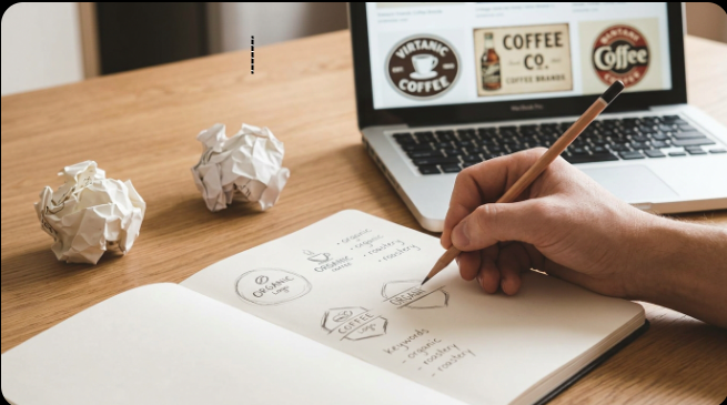
How to Design a Business or Brand Logo (Beginner’s Guide)
How to Design Business and Brand Logos
A logo doesn’t need to be complicated to be effective — in fact, some of the most recognizable logos in the world are simple shapes, a single color, or just well-styled text. What matters more than complexity is that it’s clear, memorable, and works at any size, from a tiny app icon to a large banner.
This guide walks through designing a logo yourself using free tools, plus the core principles that separate a professional-looking logo from an amateur one.
What You Need
- A free Canva account (or similar design tool)
- A clear sense of your brand’s personality (playful, serious, modern, traditional, etc.)
- Your business name and, optionally, a tagline
- An idea of where the logo will be used (website, social media, packaging, print) — this affects the format you’ll need later
Step 1: Decide on a Logo Type
Most logos fall into a few categories:
- Wordmark: Just your business name, styled distinctively (like a stylized text logo)
- Lettermark: An abbreviation or initials (like a monogram)
- Icon/symbol mark: A standalone graphic symbol, often paired with text
- Combination mark: Text and an icon used together
If you’re not sure which fits, a combination mark is usually the safest starting point — it gives you flexibility to use the icon alone later once your brand is more established.
Step 2: Research for Inspiration (Not Copying)
Look at logos in your industry to understand common visual language — but the goal is to find a way to stand out within that space, not to recreate an existing design. Save a few examples you genuinely admire and note specifically what works about them (a color, a shape, a font style) rather than copying the whole logo.
Step 3: Start Designing in Canva
Search “Logo” in Canva’s template bar to browse starting layouts, or build from a blank square canvas if you’d rather start from scratch. Use the Elements panel to search for simple icons or shapes relevant to your business, and the Text tool for your business name.
Step 4: Keep It Simple
This is the single most important rule in logo design. A logo with too many colors, fonts, or intricate details tends to look cluttered and doesn’t scale down well. Aim for:
- 1–2 colors (3 maximum)
- 1 font (2 if absolutely necessary)
- A shape or icon simple enough to recognize even when small
Step 5: Choose Colors That Match Your Brand’s Personality
Color carries meaning — blue often reads as trustworthy or professional, red as bold or energetic, green as natural or growth-oriented. Pick colors that align with how you want your brand to feel, and use Canva’s color palette tools to test combinations before settling on one.
Step 6: Pick a Font That Fits
Your font choice says almost as much as your icon does. A serif font tends to feel classic or established; a clean sans-serif feels modern and minimal; a script font feels elegant or personal. Avoid overly decorative or trendy fonts that may look dated quickly or be hard to read at small sizes.
Step 7: Test at Different Sizes
Before finalizing, shrink your logo down to the size of a social media profile photo and see if it still reads clearly. If details disappear or the text becomes unreadable, simplify further. This step catches problems most beginners miss until it’s too late.
Step 8: Export in Multiple Formats
Once finalized, export your logo as:
- PNG with transparent background — for use on websites, social media, and overlays
- PDF or SVG — for print work or if you’ll need to resize it without losing quality later
If you haven’t removed a background before, our step-by-step background removal guide (linked below) covers exactly how to get a clean transparent PNG.
Once you’re comfortable with these basics, logo design becomes less about talent and more about following a clear process — restraint, testing at small sizes, and matching color and font to the feeling you want your brand to give off. If you want to build your visual skills further, our Graphics, Design & Creativity section has more tutorials in this direction.
How to Fix Common Problems
Logo looks fine big but messy small: Simplify — remove fine details, thin lines, or extra elements that don’t survive shrinking.
Colors look different across platforms: Save your exact brand colors (hex codes) and reuse them consistently rather than eyeballing shades each time.
Logo feels generic or similar to competitors: Revisit Step 2 — look for a distinctive detail (a specific shape, an unusual color pairing) rather than following the most common style in your industry.
Background isn’t transparent in the exported file: Make sure you exported as PNG with the transparent background option enabled, not JPG.
Frequently Asked Questions
Can I design a professional logo for free?
Yes. Canva’s Free plan includes enough templates, icons, and fonts to design a clean, professional-looking logo without paying anything.
How many colors should a logo have?
One to two colors is ideal; three at most. More than that tends to look cluttered and can cause printing/reproduction issues later.
Do I need a designer to make my logo look professional?
Not necessarily — following simplicity, color, and font principles closely can get you a solid result yourself. A designer becomes more valuable for complex custom illustration work or brand systems beyond a single logo.
What file format should I use for my final logo?
PNG with a transparent background for digital use, and SVG or PDF if you need it scalable for print or large formats.
Can I change my logo later as my business grows?
Yes, many brands refine their logo over time. It’s common and often expected as a business evolves.
Conclusion
A strong logo isn’t about complexity — it’s about clarity, consistency, and restraint. Reading through the principles here gives you the framework, but actually sketching a few concepts and testing them at different sizes is where a decent logo becomes a genuinely good one.
To make that process easier, we’ve put together a free logo design checklist covering every step above, from logo type to export formats, so you can check your work as you go instead of guessing. It’s a practical companion for the actual design process, not just something to read once.
Get the Free Logo Design Checklist
A quick-reference checklist covering logo type, color, fonts, testing, and export formats.
Have a question, or want feedback on a logo you’ve designed? Drop it in the comment box below — we read every one — or reach the DCL Admin directly through our Contact Us page.
